cover app
An iOS and Android app built to take the complexity out of buying insurance. We help customers find the best coverage for anything they need to protect.


As the design lead on the app team, I worked with developers, QA and product managers to design the iOS and Android app that streamlines the process of getting insurance. This project consisted of a redesign of both the iOS and Android apps.
Responsibilities — accountable for documenting business challenges, questions brainstorm and analysis, concept ideation and prototype, finalizing designs and developer hand-off for views and interactions, designing phased approach for testing/releasing.
The first version of the app consisted of manually capturing information from leads and directing customers to sales agents through text message, where they help deliver an insurance price and bind policies. The way we ask questions was very rigid, and made it very difficult to customize and integrate with 3rd party services. With our ambitious goals of automating this entire process of buying insurance, this ultimately lead to the decision to redesign the app, focusing on updating the design and building the foundations for full scalability.
How does the customer get the most accurate quote with the least amount of friction?
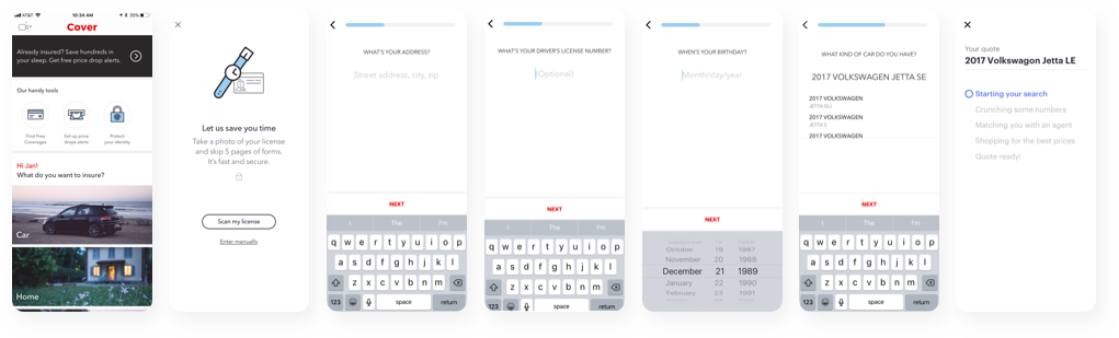
In order for a customer to get an accurate auto insurance quote, we need to collect about 80+ pieces of information. They also range in difficulty, like your name (which is hopefully easy) to car details like your VIN (which the average person won’t know without having to look it up). In the first version of the app, the goal was to get a user a quote as quick as possible, with little to no friction. That meant defaulting questions and making assumptions on the users’ behalf to get a quote. As great as it was getting a price back after so little work, the quote wasn’t very accurate and time was spent later in the process with the agents.
Research and User Testing:
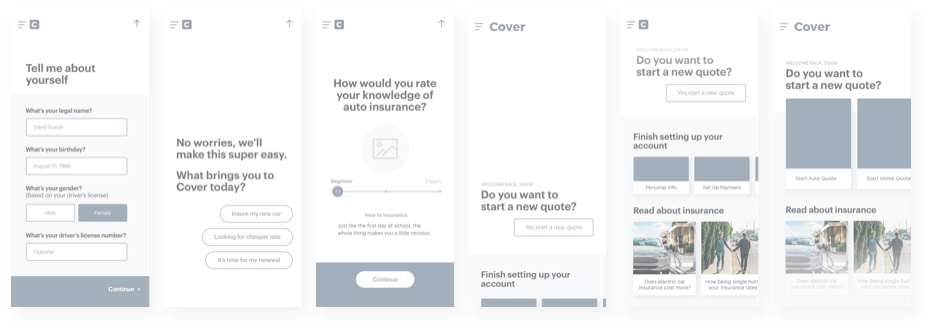
We’re fortunate enough to work with knowledgable insurance agents who interact directly with customers. From doing sales interviews, we were able to determine common questions agents asks and move them into the app.
Through user testing, we were able to stress test the difficulty of questions, how many questions became too many (equating to a tedious user experience) and at what point was there any drop-off in the flow. Since we’ve design this version of the app with the ability to easily make edits, we were able to test questions and dynamic flows at a granular level.
Solution:
As a team, we spent a lot of time brainstorming ways of getting information either from customers or from 3rd party integrations. Ultimately, we focused heavily on conversational UX because even with 3rd party integrations, we still rely heavily on users providing us the information or verifying it. We developed three key principles for crafting and testing microcopy in the app. The principles behind the app copy had to be 1) direct yet conversational, 2) provide context 3) invoke action.
These various conversations are depicted in the chat flow diagram below.
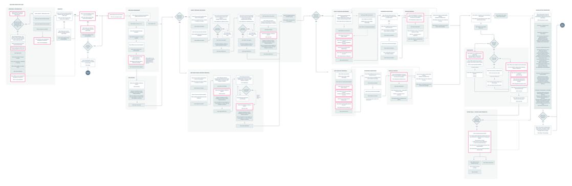
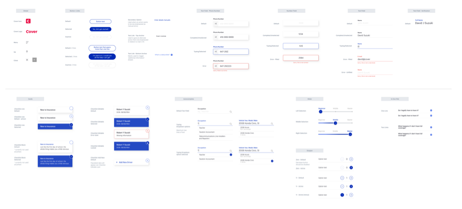
Question Flow: Design a system for future scalability and continuous iteration.
We created a design system for all the different components and templates, so we can dynamically display questions for the best user experience. Create a design system for all the different components and templates, so we can dynamically display questions for the best user experience. Create a design system for all the different components and templates, so we can dynamically display questions for the best user experience.

Delivering a price in-app was a technical challenge for our backend team because we're running the quote on 30+ insurance carriers in order to return the best price. That means designing an experience that takes into account the time delay of 30 seconds to up-to 3 minutes.
Research: We learned through user testing that customers are more tolerant of wait times if we explain the value we bring to them. While comparing the results of a spinner versus a walkthrough, we found much less drop-off when we explained the steps we were taking for the customer. Qualitatively, users found comfort and increased trust in knowing what was happening with their information and credibility of carriers we're comparing against.
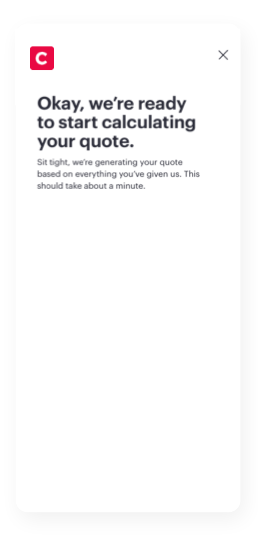
Solution: We came to the solution of delivering the detailed price inside the app after presenting a user with a progress animation of what's happening behind the scenes.
From our first iteration of the loading animation, we designed it based on the estimated time it takes calculate a price. A technical challenges was that it took roughly 30 seconds to calculate, so we designed around this limitation.
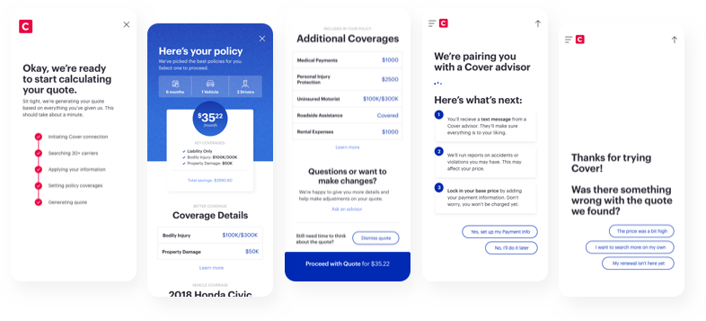
The design for the price view highlights what the monthly price is for their policy. In order to provide as much value to the user as possible, we constantly iterate on how to break down their coverages so it's easy to understand and digestible. Secondly, this is the highest point of conversion for our customers. If a user to ready to purchase, we have a clear action of how to proceed, indicating a very high intent to our agents in the sales queue. If there is uncertainty, we have the opportunity to educate customers on our insurance process and allow a secondary feedback loop for all customers. This allows us to analyze and measure user drop-off, quote completion to sold policies, and iterate appropriately.