flipp branding
Flipp is an award winning technology company that’s reinventing the weekly shopping experience. We wanted to develop a strong visual brand strategy that reflects our core mission: making weekly shopping fun and easy.


At the time when our small design team was designing the logo and branding guideline for the mobile app, we didn’t anticipate that we’d eventually rebrand our company name (Wishabi at that time) and corporate identity to Flipp in one short year.
Our company vision is a future in which consumers and retailers are connected. We feel that weekly shopping is too much work - too mundane - and we want shopping to be fun again. We want to make sure that consumers can save time and money easily. So when it came designing the visual brand, we wanted to develop something fresh, simplistic and fun.
The process is never pretty. We took the opportunity to explore dozens of different concepts for abstract shapes, iconography and logotypes. It became clear after rounds and rounds of iteration that team preferred the simplicity of a logotype. We wanted something that can grow and evolve as the brand grows. It wasn’t just about designing a logo that looks good on our app and website, but what would happen if we blew it up and hung it at the top of a 18-storey highrise? Or what would it look like in conjunction with our retailer partners’ brands? We wanted to design something that was clean, simple, modern, and professional — a brand that keeps pace with where we want to take the entire weekly shopping industry.
Apart from the logotype and iconography, we also worked on developing taglines, tone of voice, and online communication for the brand. Of course, we also designed a handful of promotional items for fans and consumers alike. Hopefully you’ll spot our shopping totes the next time you’re grocery shopping.
A common misconception is that we’re just a mobile app company, but in reality we have a wide range of products and networks. At the base of all our products, we strive to maintain visual consistency that ties it all back to the basics of the Flipp brand. All UI and visual elements follows the brand guidelines we’ve set in place. The goal to tie the Flipp corporate brand as well as all our consumer brands together. We understand the goals and audiences for each product, service, microsite or even marketing material are all different, but the visual messaging is simple — we want to represent simplicity and fun. Whether it’s with iconography, colours or UI elements.
Once upon a time, we had two different brand identities, one on a business to business level (Wishabi) and one to consumers. There are many cases where that wouldn’t become an issue, but as the Flipp consumer brand grew, it became evident through our conversations with our partners that it just made sense to consolidate the two together. For our partners, Flipp is powering their flyers with our flyer and retail marketing services — also know as our Flipp network. Flipp, the mobile app is just one of the many networks to reach their consumers weekly, so they can tell their weekly shopping stories in the digital age.
With the redesign of our corporate website, we took the opportunity to tell our company story. We’re a leading technology company in the retail space, so we wanted our website to reflect that. Our goal was to create a website that pulled in strong imagery that illustrates to our partners (and future partners) what we can provide to them and their business. It was time we shed the connotation that we’re a small app startup in Toronto. We’re actually a large, experienced technology company powering some of the largest retailers in North America — let alone trying to distrupt an entire industry. With that, we can’t do it alone — another facet of the website redesign included a revamp of our company culture / careers section. The goal was the tell our story, and our story started with our people. So a large focus was to illustrate our day-to-day adventures at the office, and at the core, our priniciples and culture.
View live site here: here


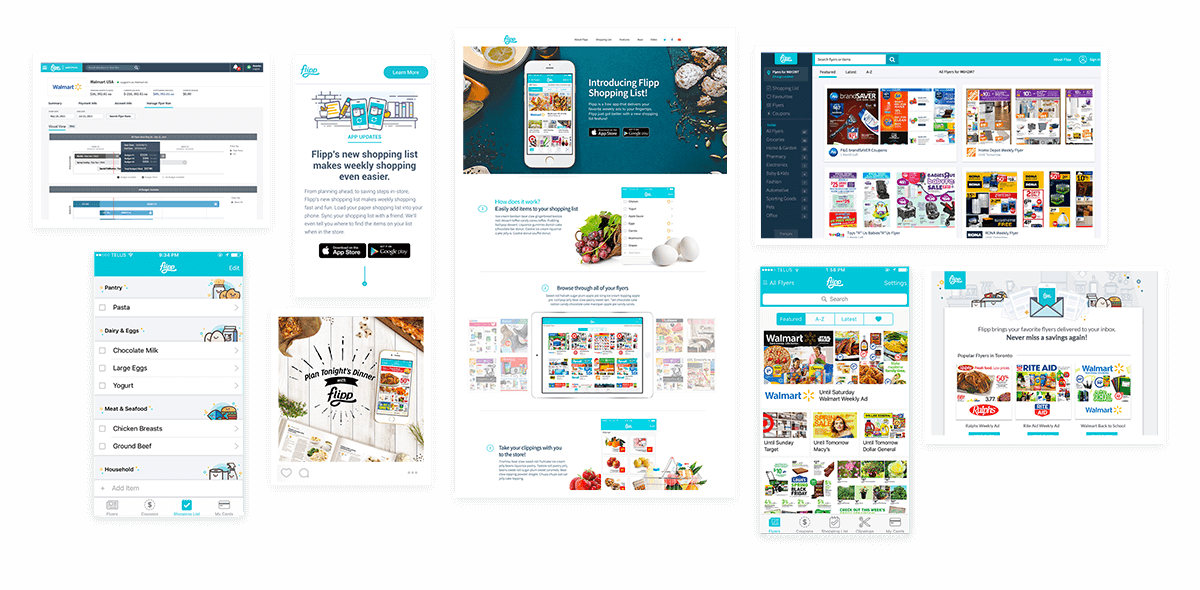
Integrated campaigns are ones that span across multiple platforms and channels while telling a cohesive story. Below is an example of a campaign we created to showcase ourselves as leaders in consumer shopping. Content was the differentiator, so that's what drove the design. We ensured that the content was clear and consistant as we adapted it into different mediums and for different channels.
Project included: Microsite, email advertising, paid and organic social media

People spend a lot of time and effort designing and perfecting an app or site. But what's the point if it never gets into the hands of users? My role as a Growth designer is to acquire active high quality Flipp users. This is carried out through a variety of channels. Currently, we look to acquire users through digital channels such as Facebook, Instagram, Pinterest, Twitter, Google, Gmail, ads in other apps (through AdMob), as well as various out-of-home marketing initiatives, including TV ads and printed ads.

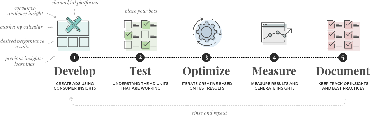
Develop: Growth marketing relies on a number of different teams in order to do the job well. Design works very closely with Growth (or Media Science), as well as Insights and Marketing. Design isn't created on a whim (well sometimes it is, but let's not go there), it's based on a number of different things including consumer and audience insight, previous campaign learnings, desired results, marketing calendar and more. It's the job of the designer to take all those learnings and design compelling creatives that drive action.
Test: Strong performance and metrics is what's important. There have been many times when I've designed something I've loved visually only to have the numbers shoot it down. That's the ultimate validation, and I try to embrace that whole-heartedly when I'm working on growth projects. The entire team has a testing approach and we subtly take bets on top performers.
Optimize: From the test, we'll have top performers and low performers. From here, we're constantly iterating our designs to optimize the metrics. It might be changing the call to action so it's more prominent, or changing the verbage on the ads, but we always have iteration on our minds.
Measure: When a campaign is done or if the metrics are on a decline, we take the time as a team to review everything. Was our hypothesis on the audiences correct? How were the overall CTA numbers? What's the quality of users we acquired from this campaign? Nothing is off limits when it comes to learning and improving for the next set.
Document:We have since documented each high performing ad or campaign and added it to our creative arsenal. Since we're aware of how quickly the digital advertising space changes, we have developed key Flipp creative principles that have proven successful. Not only does this help scale our process, it helps scale the entire creative team.