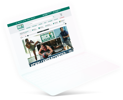
flyer platform


Scalability is at the top of mind when it came to designing a flyer browsing experience that can be themed and applied to hundreds of retail partners. The end product resulted in a seamless experience for customers where the retailer's weekly stories are seamless anywhere and on any device.
Here are a few of the Fortune 500 companies I had a chance to work with:

Over 100 of the North America’s largest retailers use Flipp Retailer Services to power their properties. So when designing a solution to ease the browsing of digital flyers for all consumers, we had to identify the principles of a good discovery experience. Content is the major differentiator, because at the end of the day, all retailers are trying to convey one message — what is going on in their store this week. So an important feature was maximizing the real estate for the flyer content as well as enabling rapid browsing so content is easily consumable. It’s not an easy job, because they come in all different shapes, colours and size. Some are beautifully designed while some are inherently ugly (but there’s always reason to their madness). The ultimate question, how do we create an out-of-the-box experience that’s scalable across hundreds.

Imagine posing the objective like this — retailers want to tell consumers what's happening in their store this week. Leaving a lot of the storytelling of their brand and promotional stories to their flyer, we created features that enhances the content to it's fullest extent. But that's only one side of it. We also did it by introducing features that act as an extension of the store experience.
Features that enhance the content include showcasing product detail pages on individual items that normally wouldn't be available on print. Utilizing the power of digital, we're able to showcase the full story of a product — including but not limited to multiple product shots, videos, related articles, nutrition guides and more. We enable consumers to quickly browse and zoom on the print versions, as well as giving consumers the option to easily view all the products in a grid format or sort by category. The goal is to support print but enhance it for digital.

Exploration and Wireframes (Flyer selection)

Why do it multiple times when you only need to do it once? This is a tough challenge especially when working with very widely estabished brands that want a customized experience that matches seamlessly across their desktop and mobile experiences. A large portion of the design process was identifying areas of customization that would be needed on a product level. As a designer, you want ensure it looks pixel perfect every single time — but in this reality, it's designing for the 90% case. Can an experience look customized by simply changing colours, fonts and backgrounds? Can features be turned on or off depending on the partner? Those are some of the considerations that went into designing an agile experience that can be applied to all.

